Product designer
Product Strategist
Project Manager
Healthcare
8months
Arjav Jain
Chinonso Maduforo
Joshua Hochman
Urvi Varma
Ruchica Sinha
Figma
Miro
Useberry (User Testing)
Chat Gpt - Simulated Resarch
Claude -
Resarch Analysis
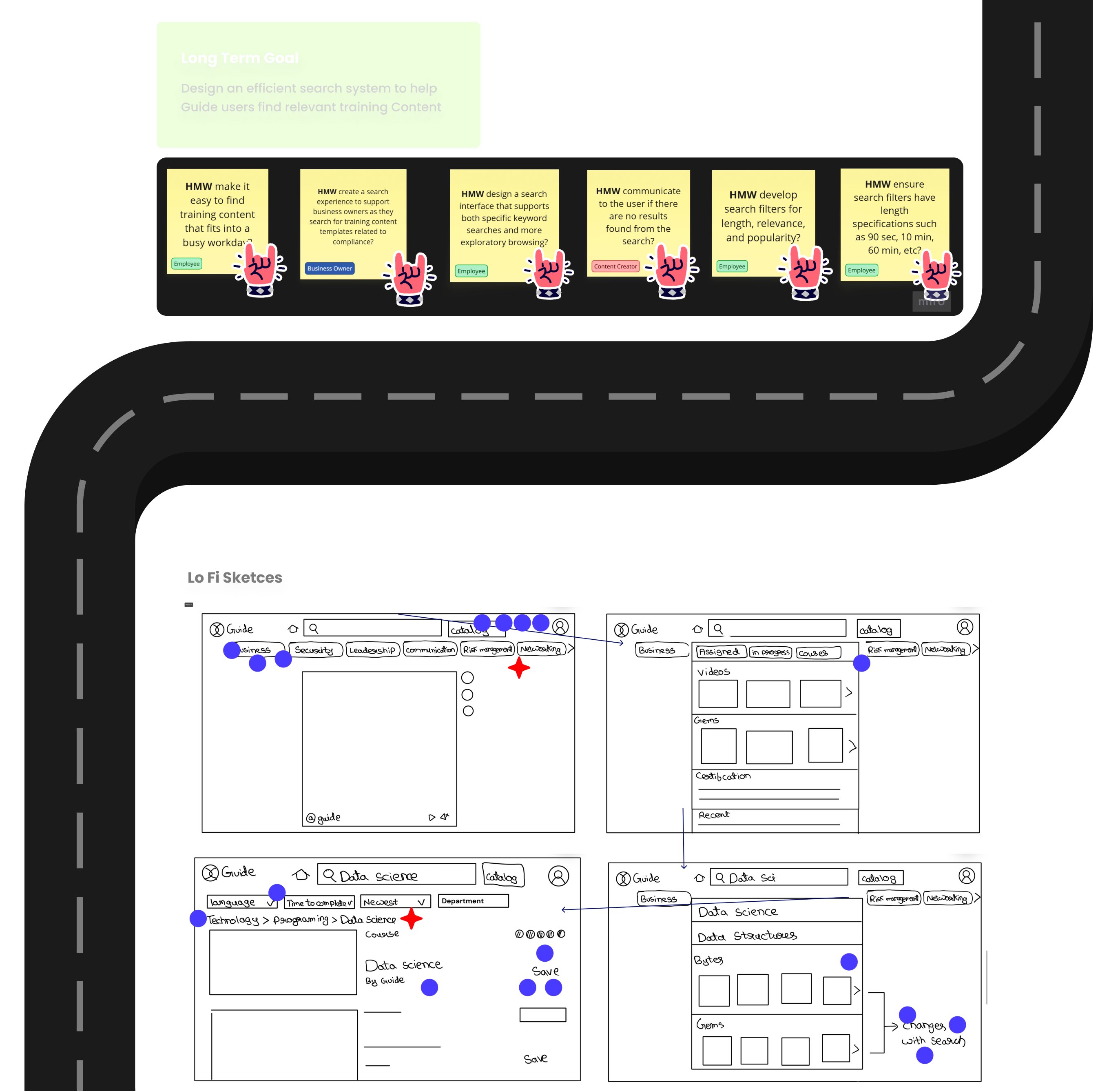
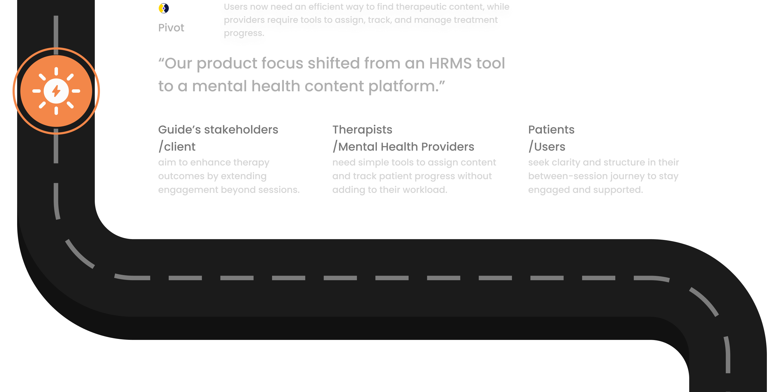
Guide started as a corporate LMS where companies uploaded 90-second training videos for employee development. However, the platform lacked a dedicated search system—users were forced to manually browse through endless content.
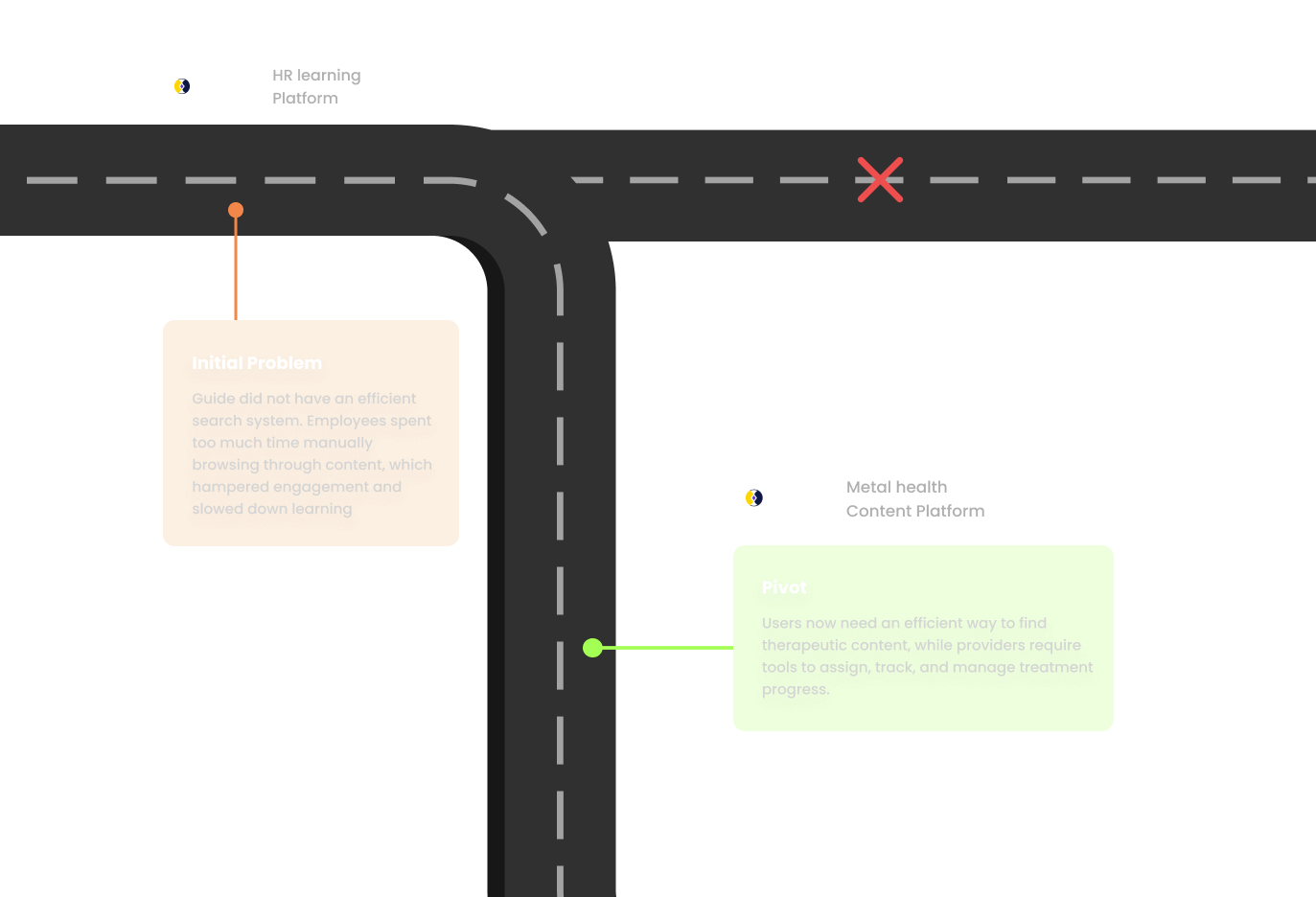
As our project progressed, Guide as Company pivoted its focus. Instead of solely serving corporate training,
the
platform began targeting mental health—where therapists (as content providers) and patients (as users)
replaced companies and employees.
Mental health providers lack effective tools to maintain patient engagement between sessions. Without a
streamlined way to assign content and track completion, therapy effectiveness suffers.
Patients
experience uncertainty about their between-session work and have no structured way to demonstrate
engagement. This gap in care continuity reduces treatment effectiveness for both providers and patients.
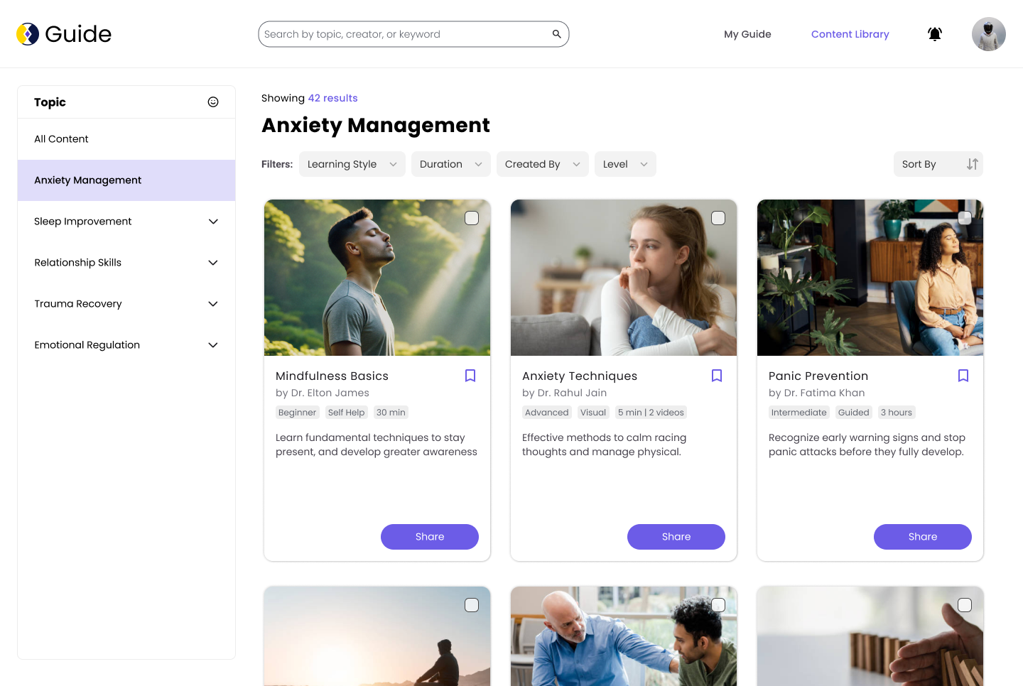
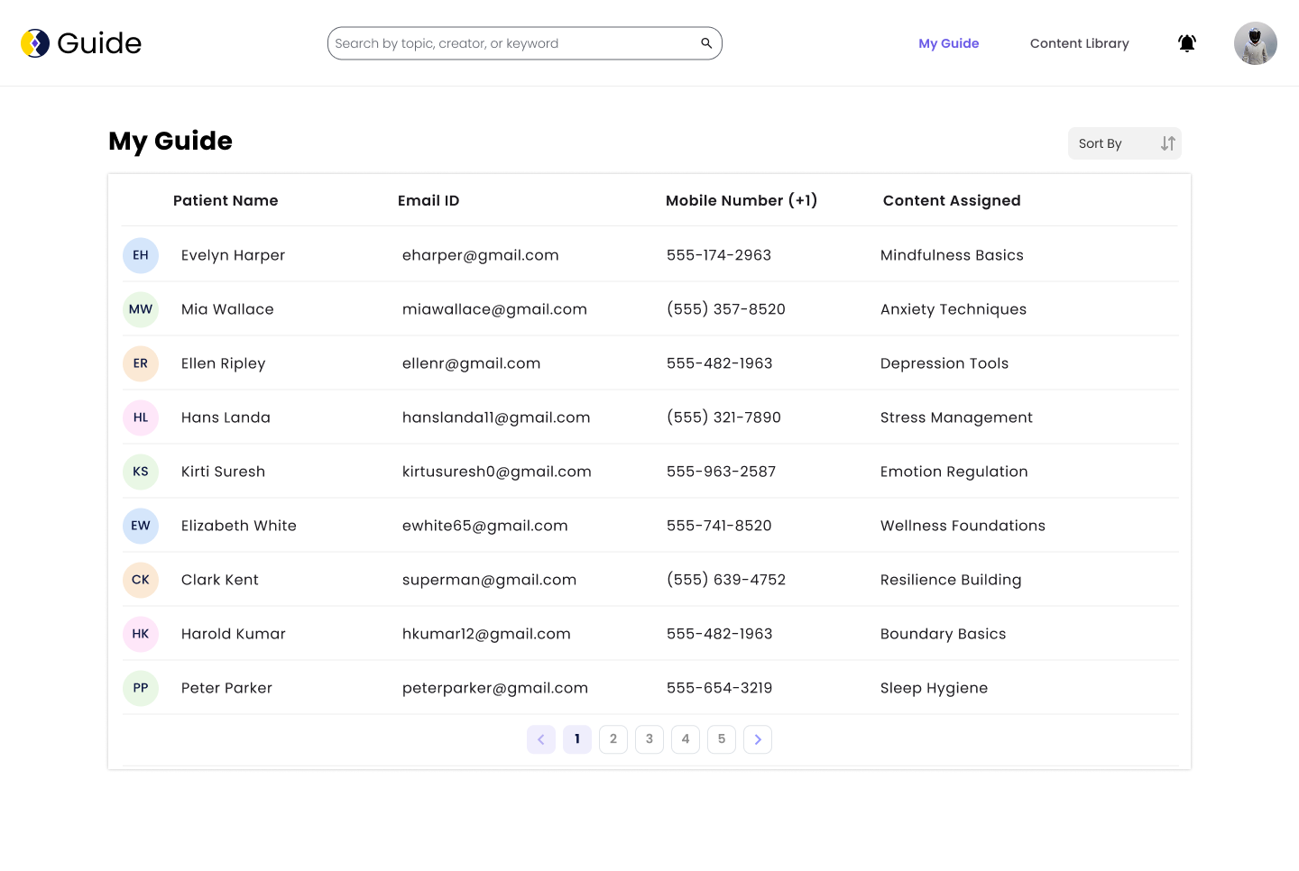
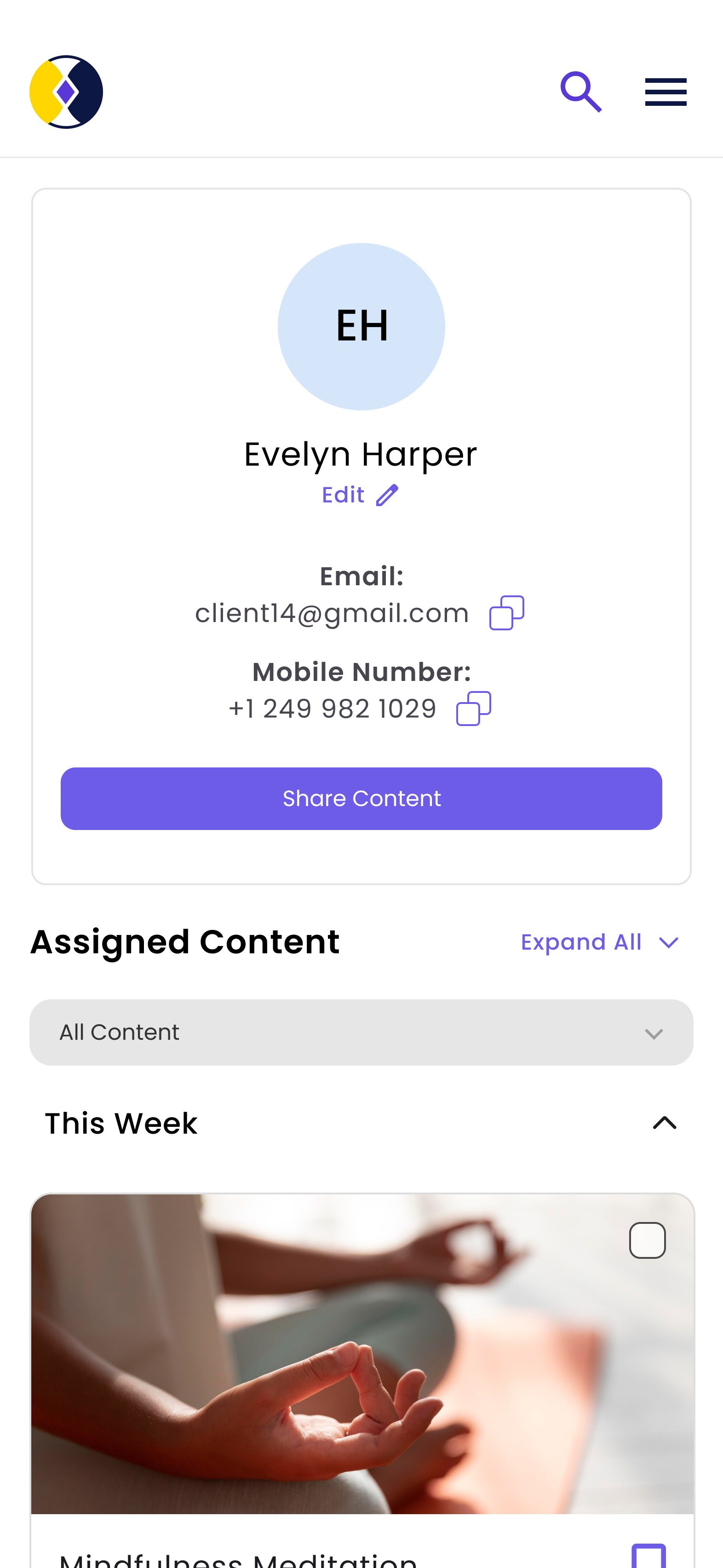
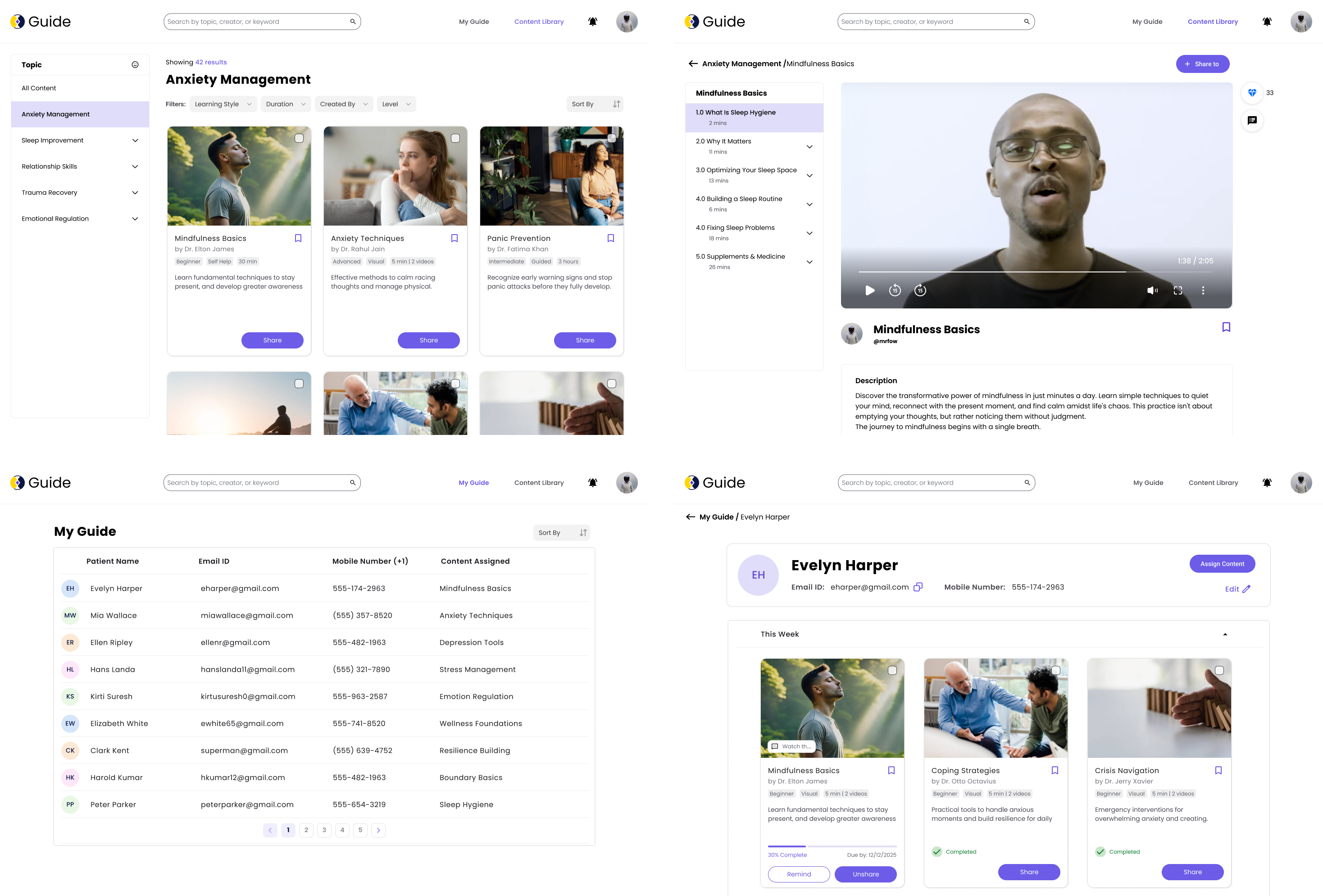
A dual-interface experience crafted for both therapists and patients — focused on clarity, connection, and
continuity.
From search to content tracking, every screen was built with empathy and iteration.
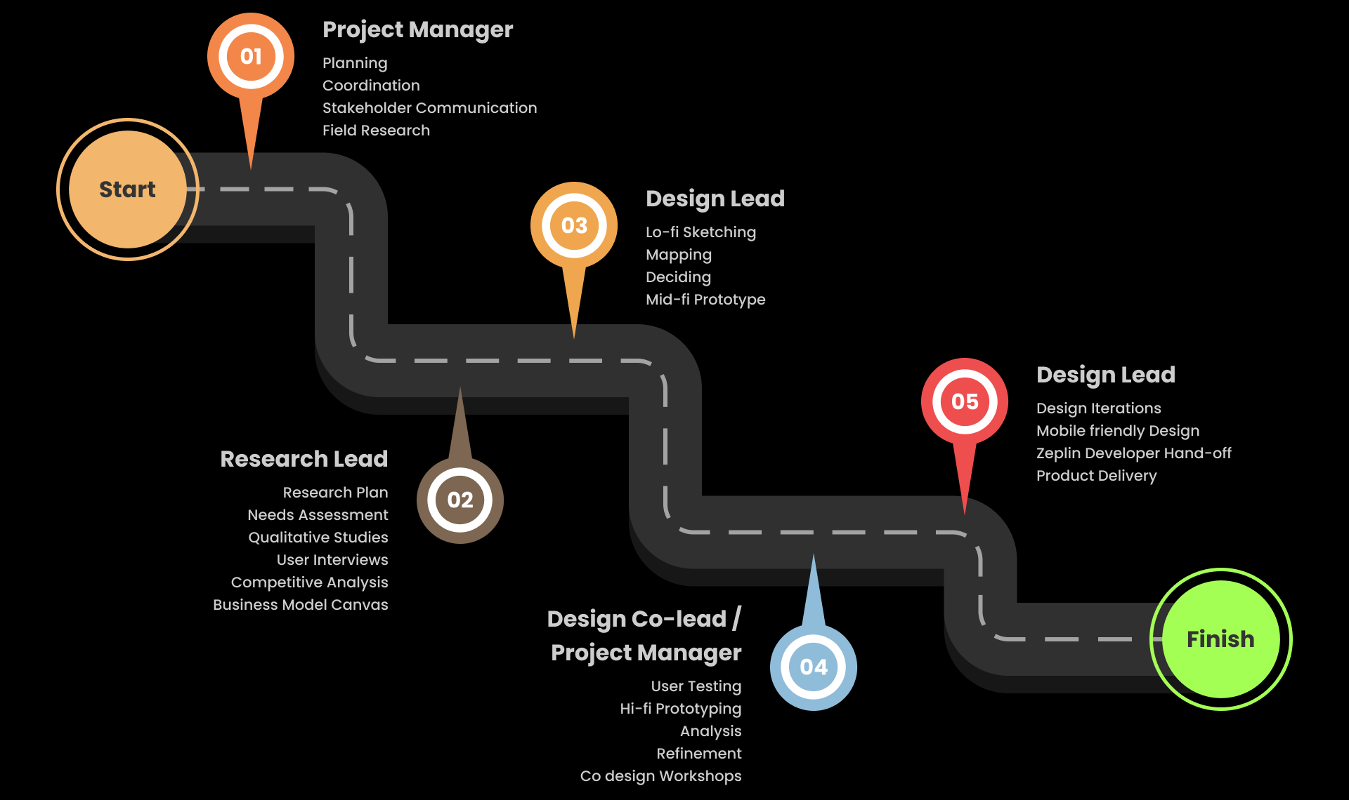
Throughout the project, I took on multiple roles—ranging from design, research, facilitation, and scheduling to documentation and coordination. However, I primarily led design across sprints and drove research during the discovery phase.
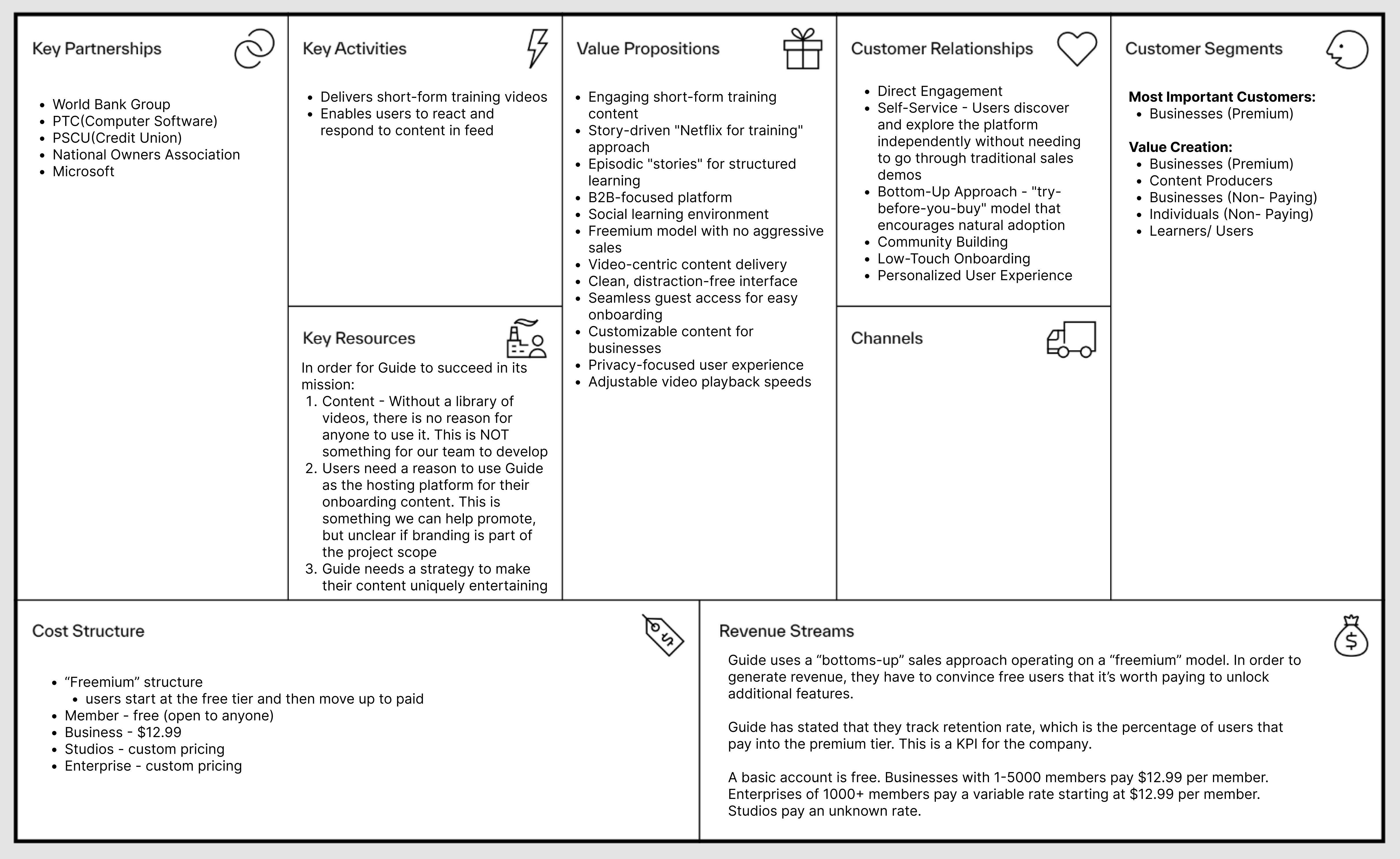
We began by mapping out the entire business model to understand key value propositions, target users, revenue streams, and partnerships.
We conducted a deep dive into academic papers and books on search patterns, best practices, and user experience in online learning environments.
Indexing: Ensure all relevant content is indexed (pages, media, metadata).
Controlled Vocabularies: Use standardised terms for accurate results.
Relevance & Authority: Improve content quality, metadata, and keyword use.
Search Algorithms: Weigh relevance and user behaviour, offer faceted
search.
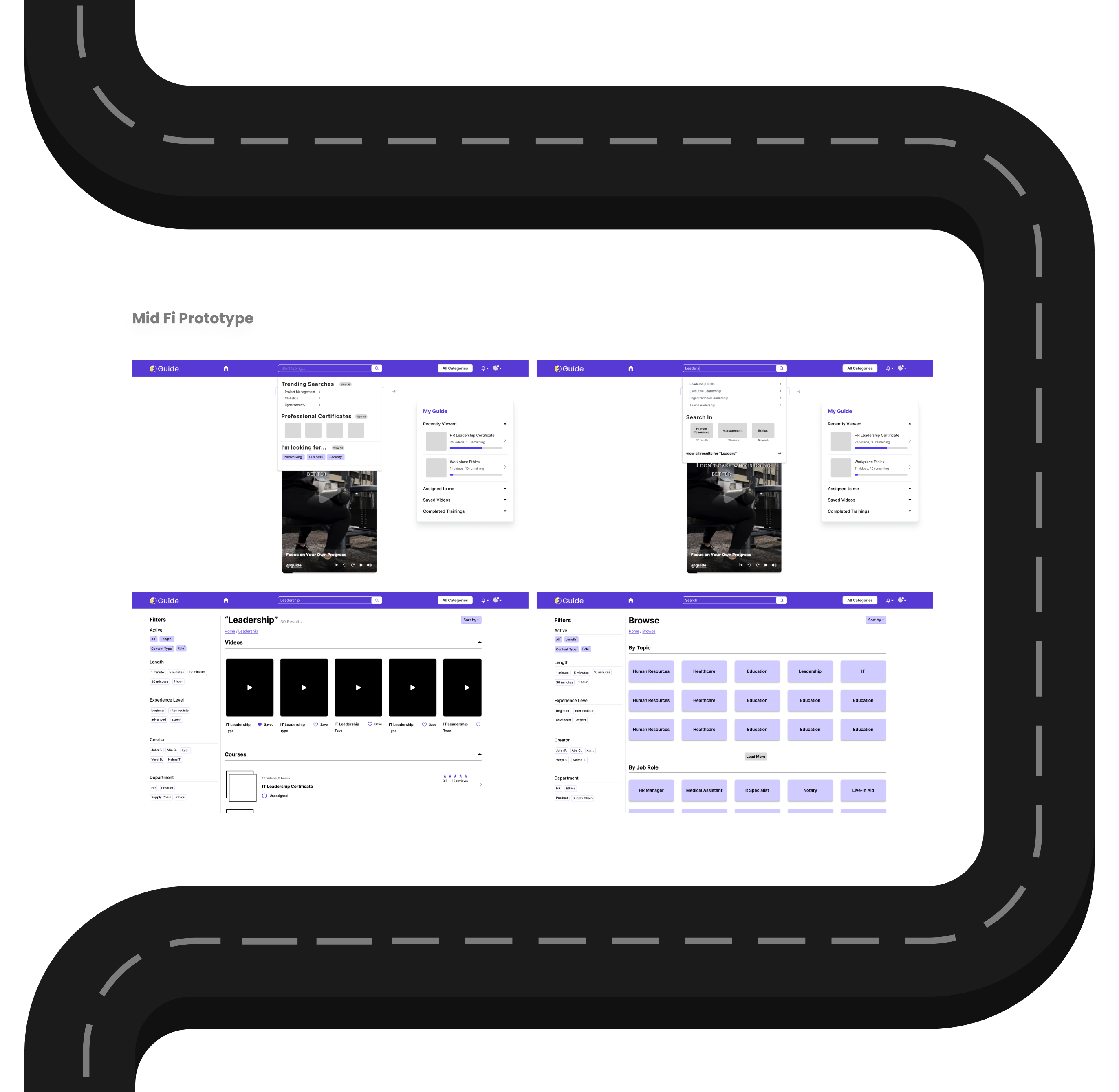
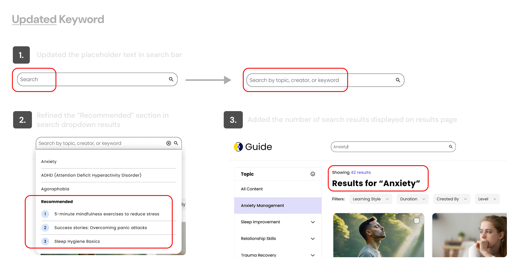
Clear Design: Simple, mobile-friendly, with autocomplete and filters.
Present Results: Organized, keyword-highlighted results with sorting
options.
Behavior Tracking: Monitor search interactions to refine content and algorithms.
Personalized Search: Tailor results based on user preferences and history.
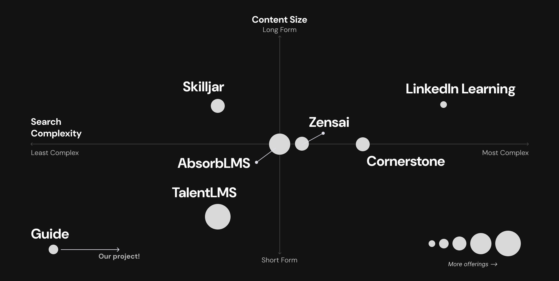
We analyzed leading platforms such as Cornerstone OnDemand, LinkedIn Learning, Absorb LMS, TalentLMS, Skilljar, and Xensai.
2 business owners
1 Employees
4 HR Professionals
1 Expert Interview
LMS tools
Productivity
Education
Healthcare
IT
1. Compliance Focus:
Training was often seen as a checkbox task.
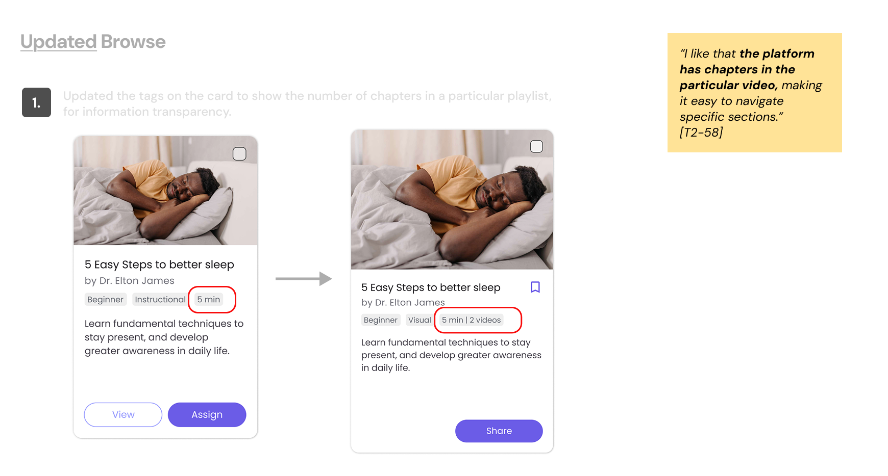
2. Content Previews:
The ability to preview content was highly valued.
3. Curated Recommendations:
Users preferred systems that suggested relevant content.
4. Discovering Resources:
Explore more content aligned with their learning goals.
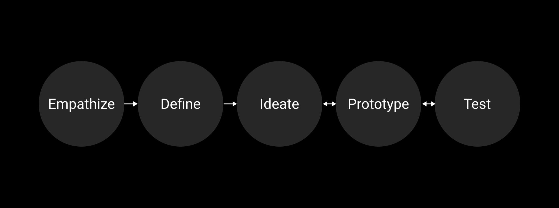
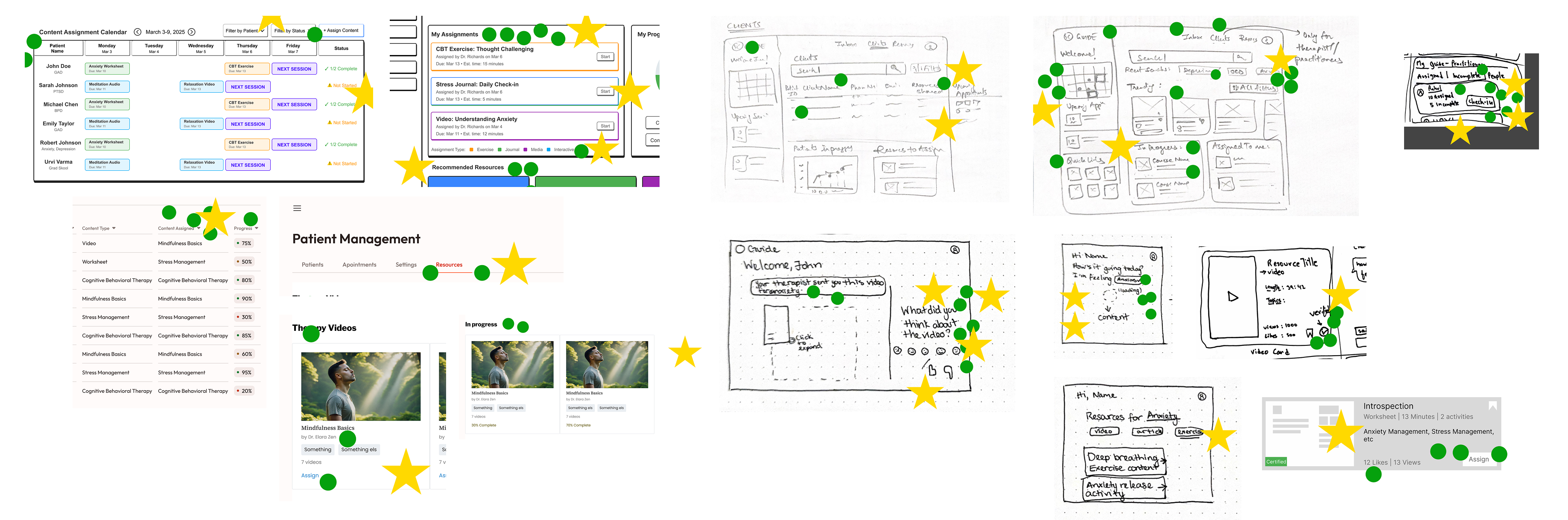
We mapped, sketched, decided, prototyped, and tested—each step shaped our early design process.
4 Healthcare Proffesionals
1 Expert Interview
LMS tools
2 with “tech” familiarity
2 with mid- level familiarity
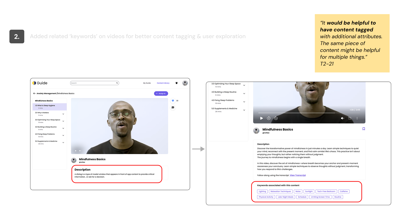
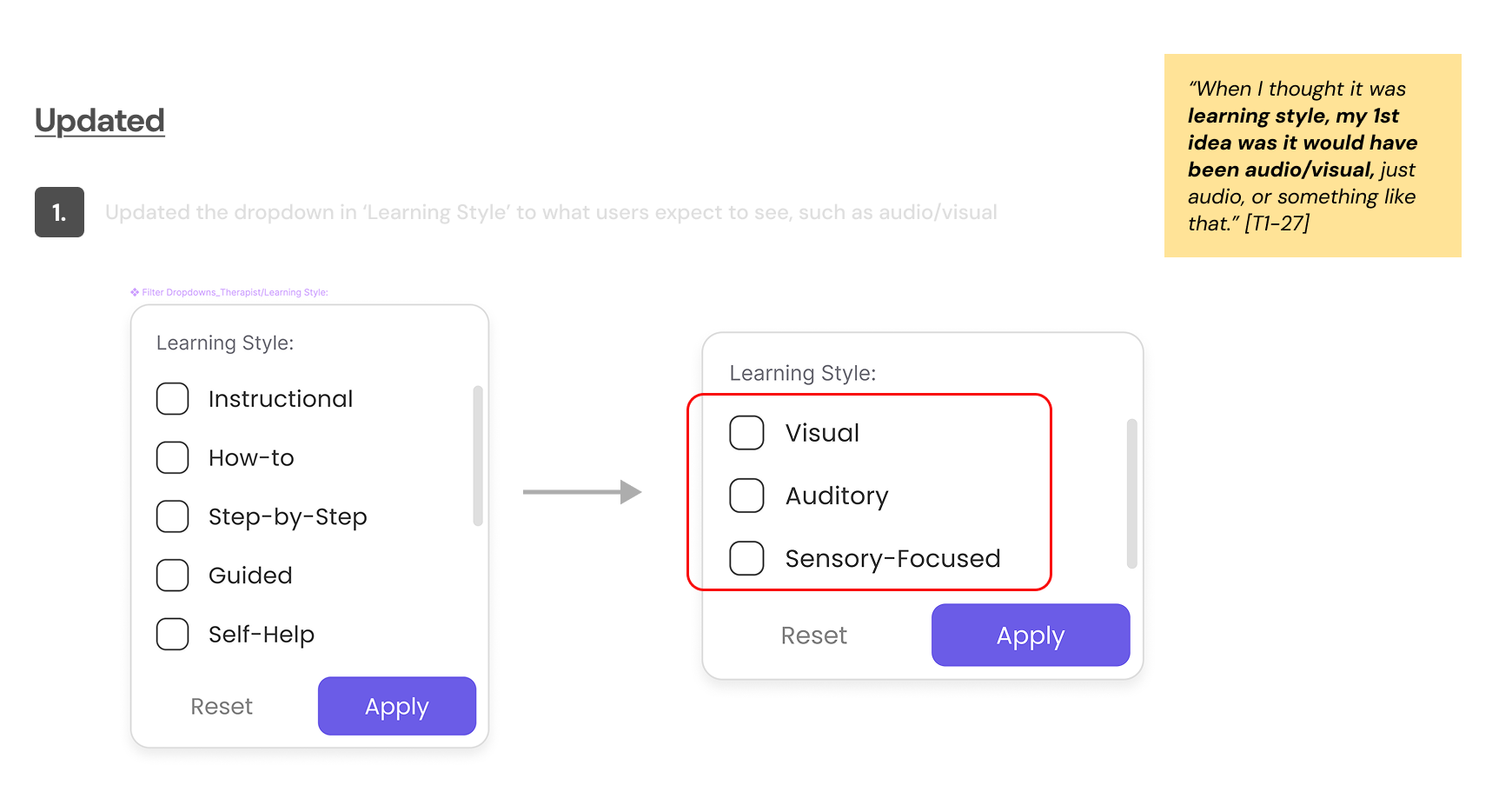
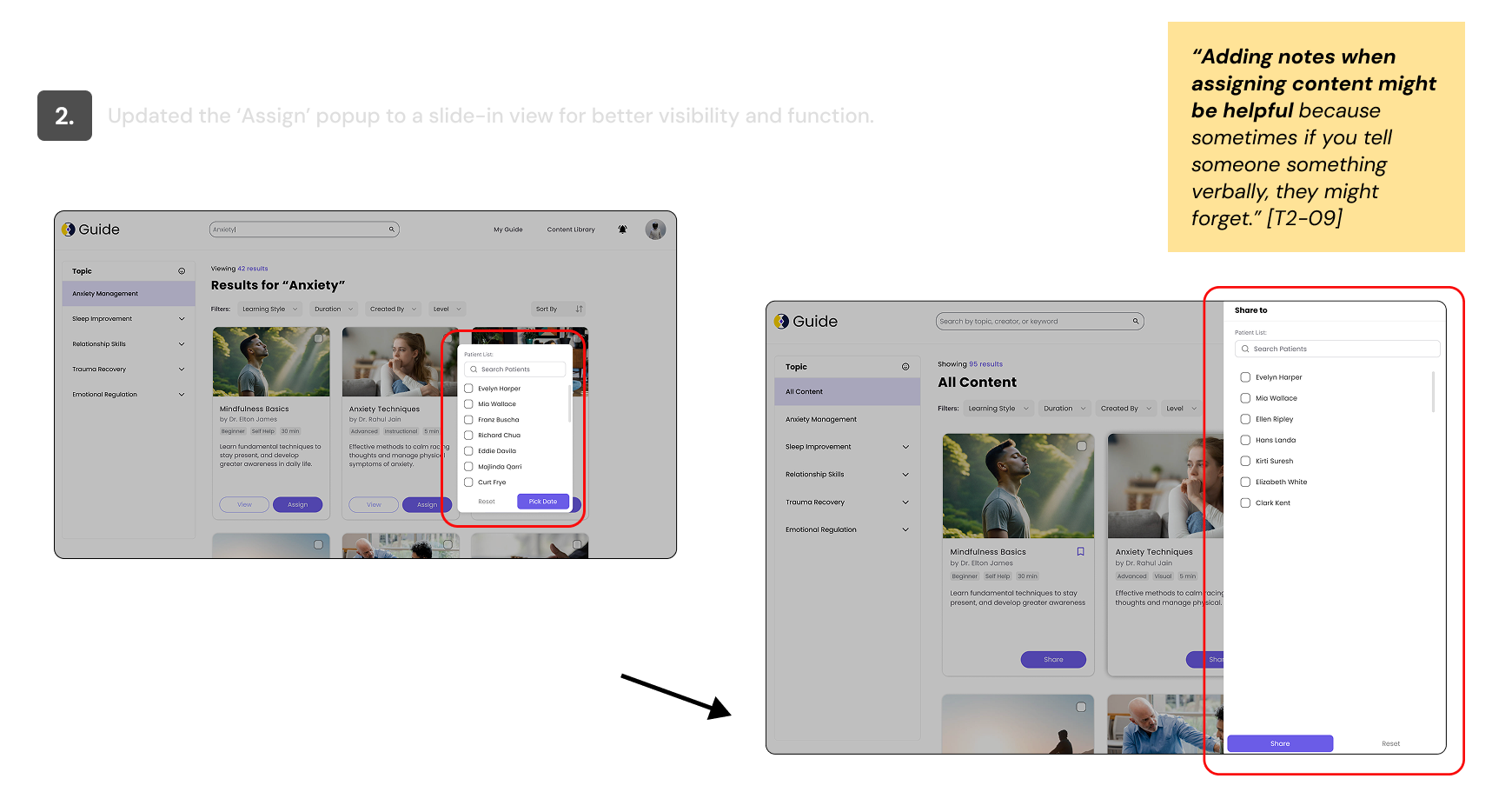
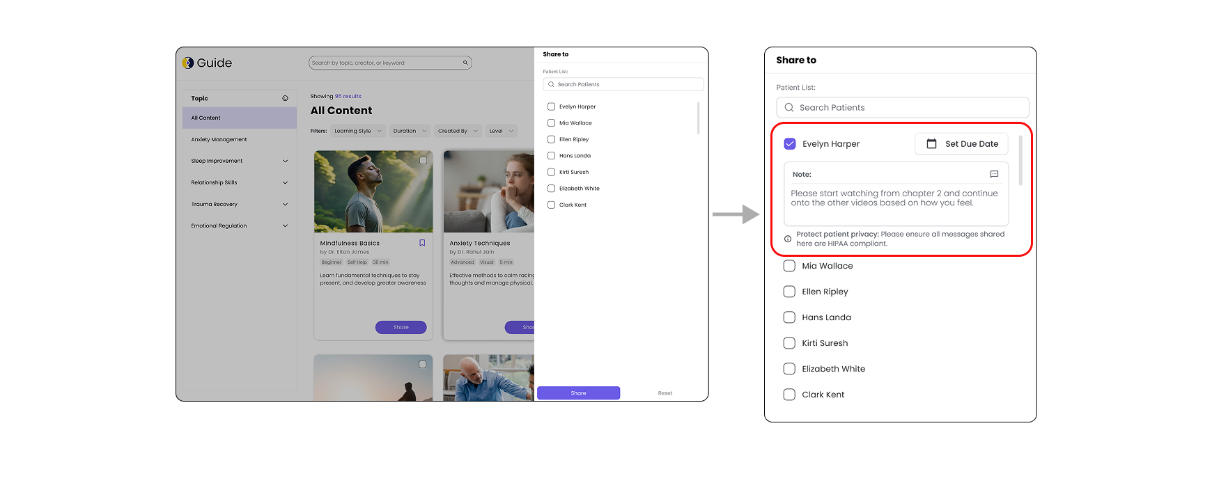
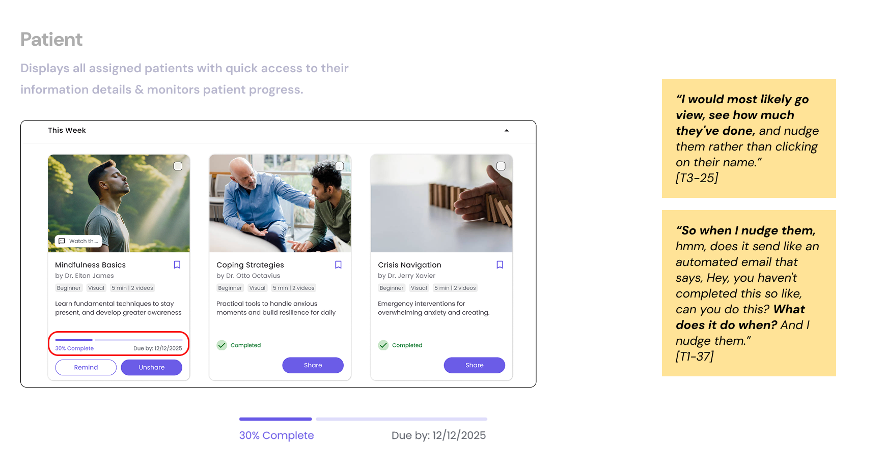
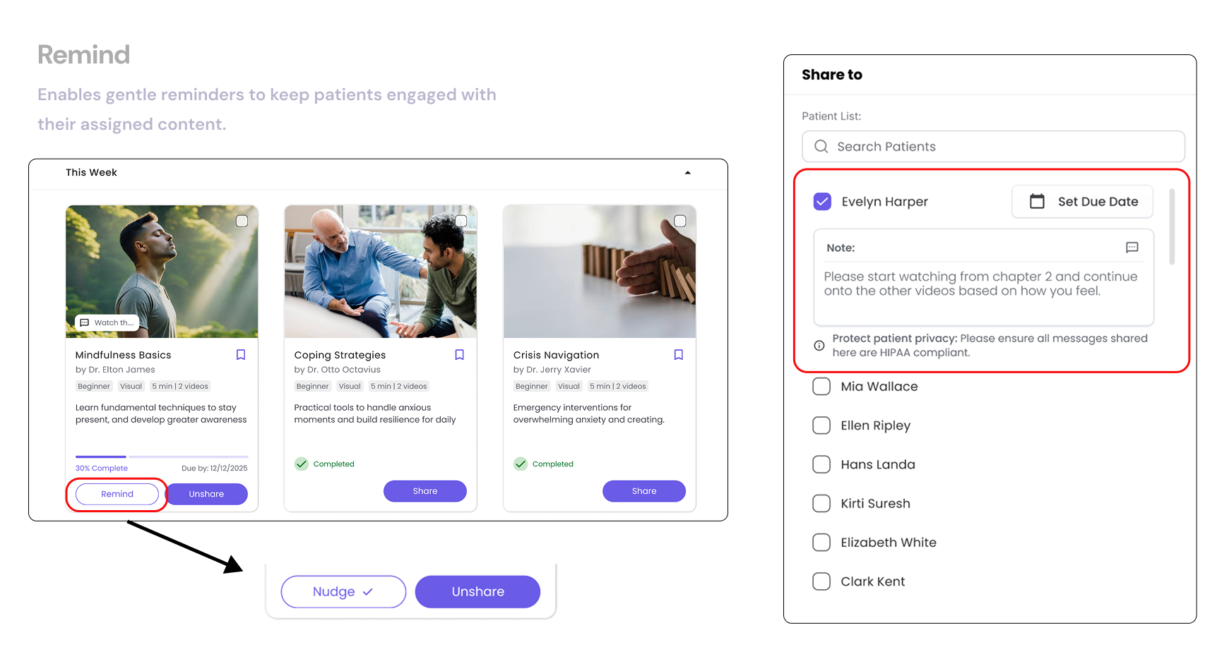
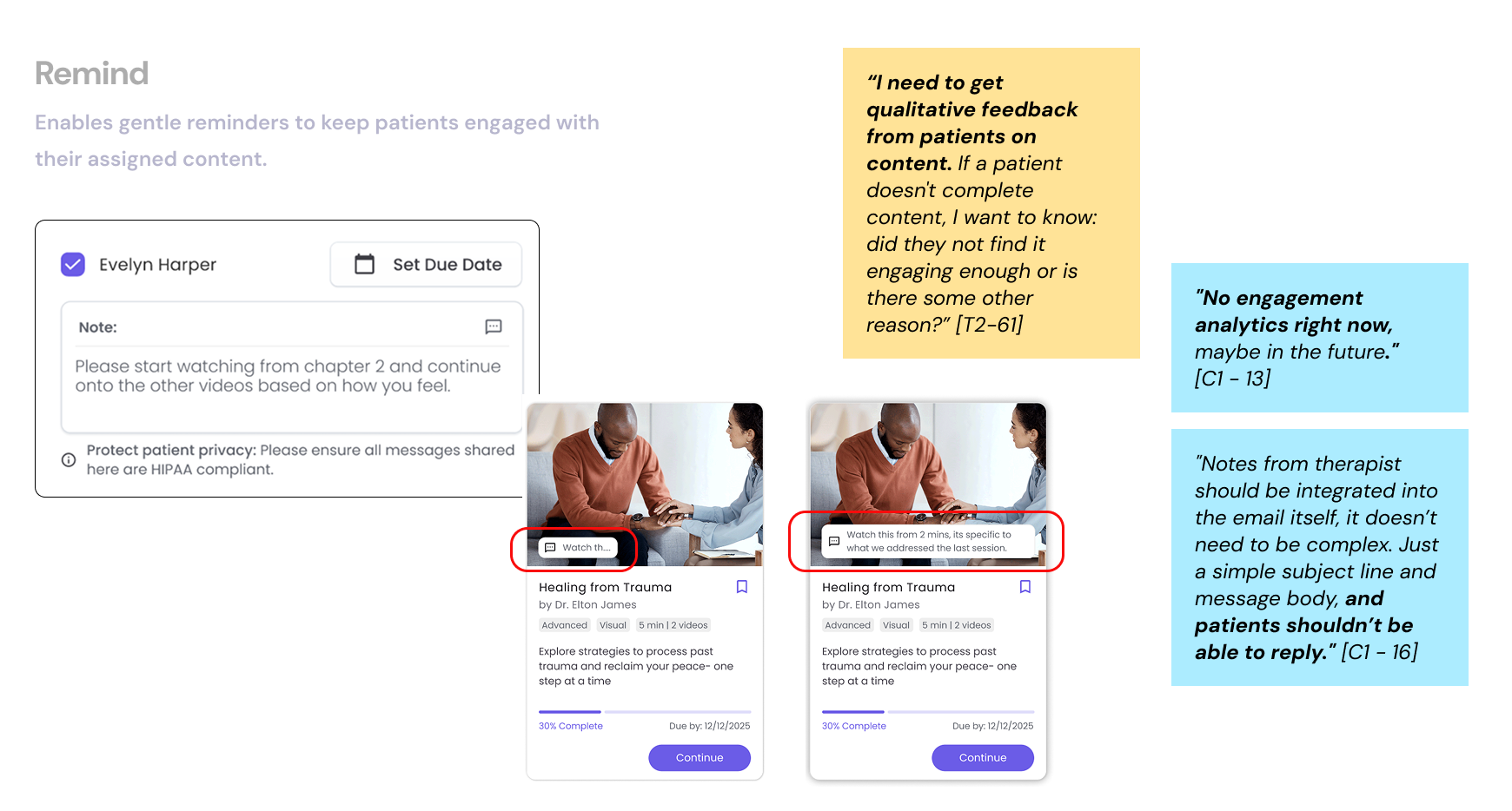
“It would be helpful to track whether a patient accessed or completed a resource. This would allow me to
see if they engaged with the material or if I need to offer something different.” -
(P1-32)
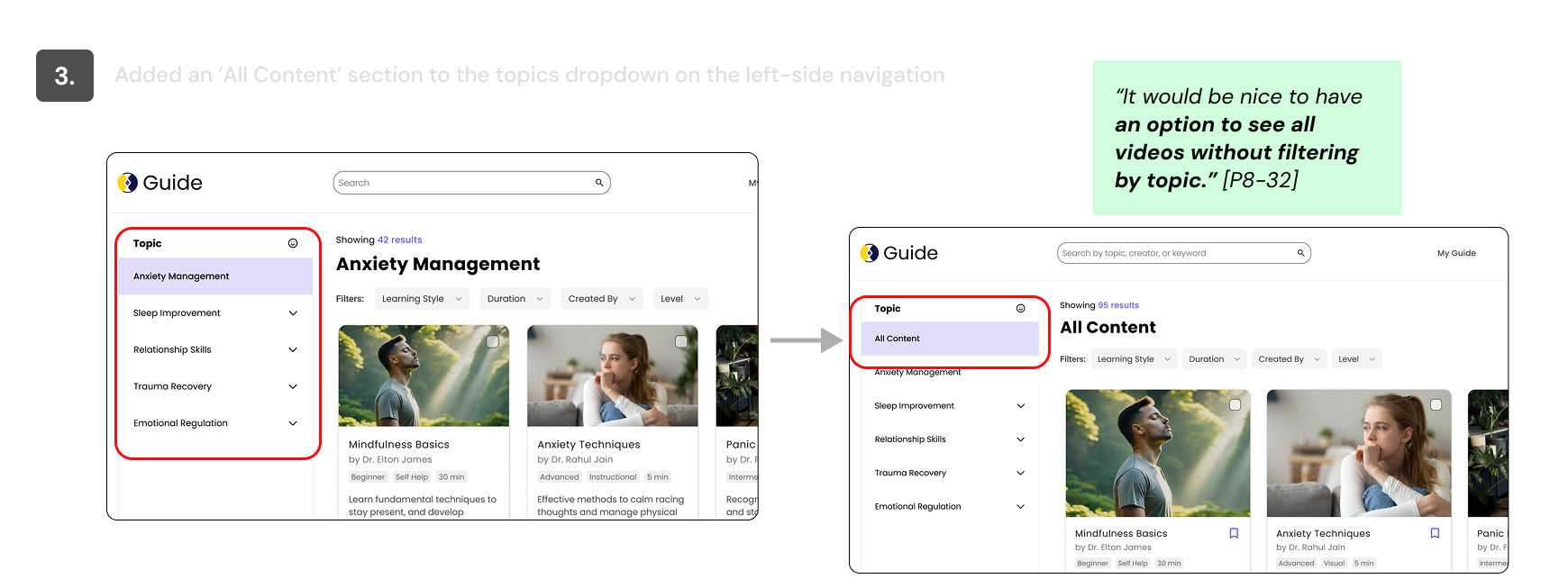
“I prefer browsing mental health resources by category rather than keyword searching. Having predefined
categories allows me to quickly find relevant materials for my patients”-
(P1-35)
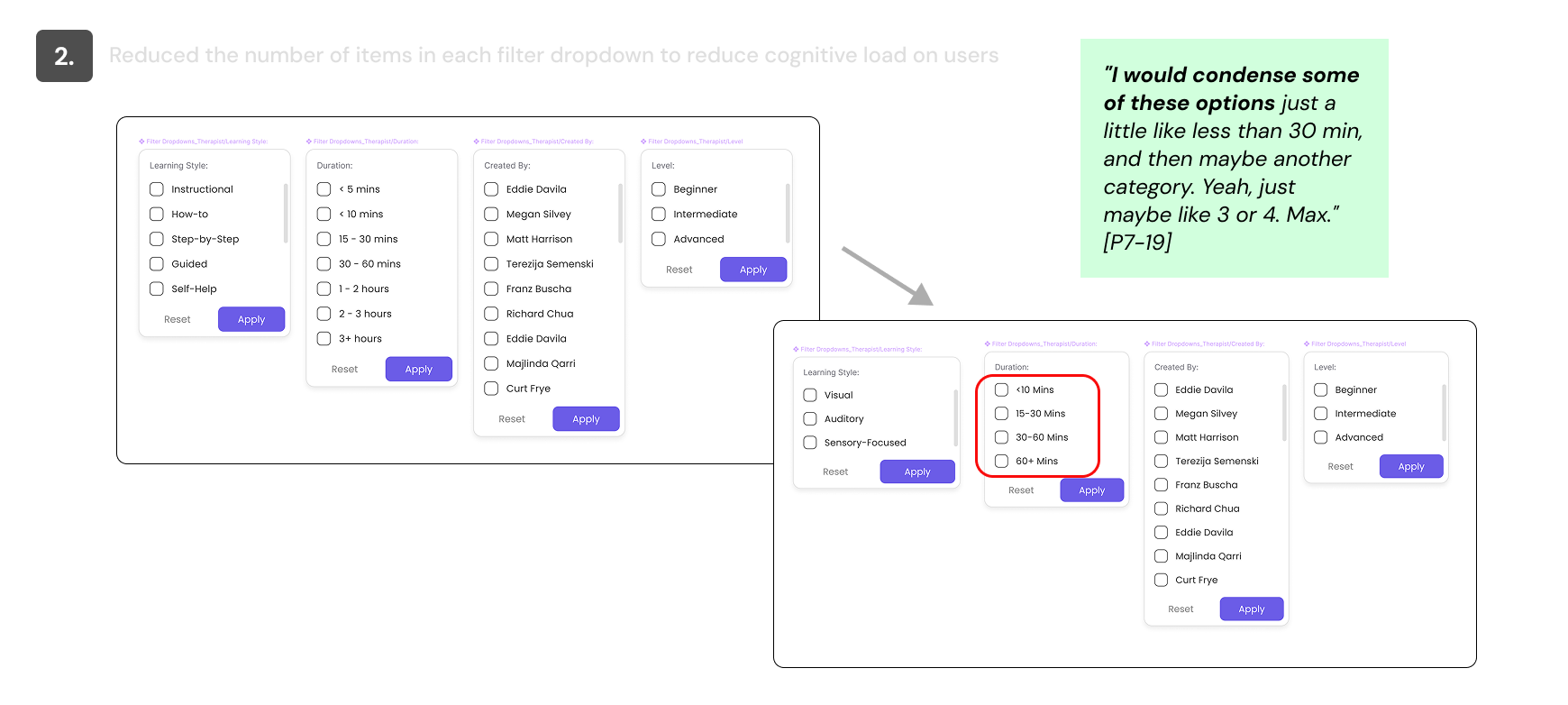
Efficiency is important because my time for reviewing and assigning resources is limited. Any tool I use
must allow me to quickly find, evaluate, and send materials to patients.-
(P2-37)
"When searching for resources, I preferred to start broadly and then narrow down options based on
relevance."-
P4-106
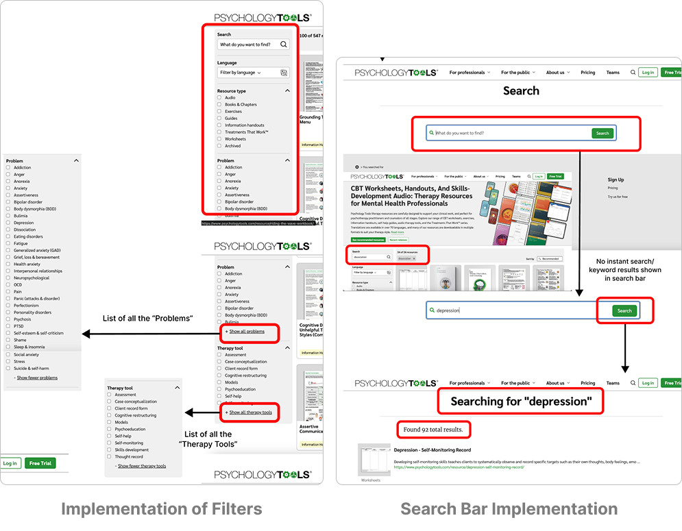
1. TherapistAid
2. carepatron.com
3. Psychology Tools
4. Talk Space
5. Amwell
1. User flow Recreation 2. Systematic annotation of key features
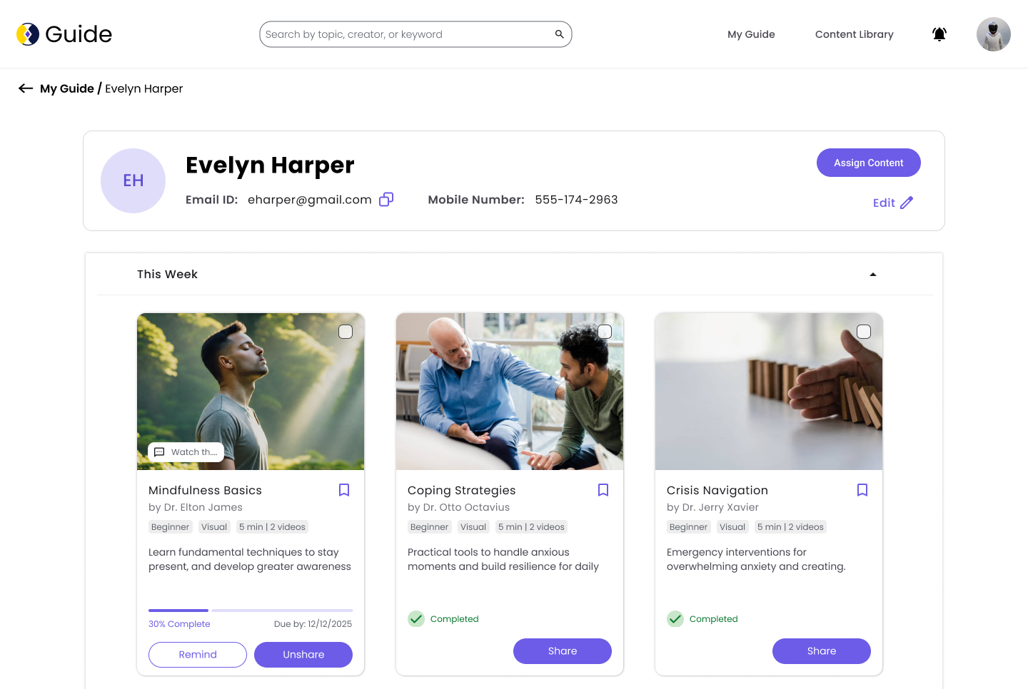
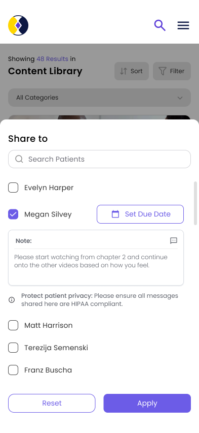
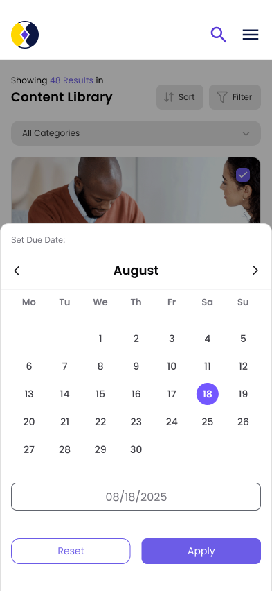
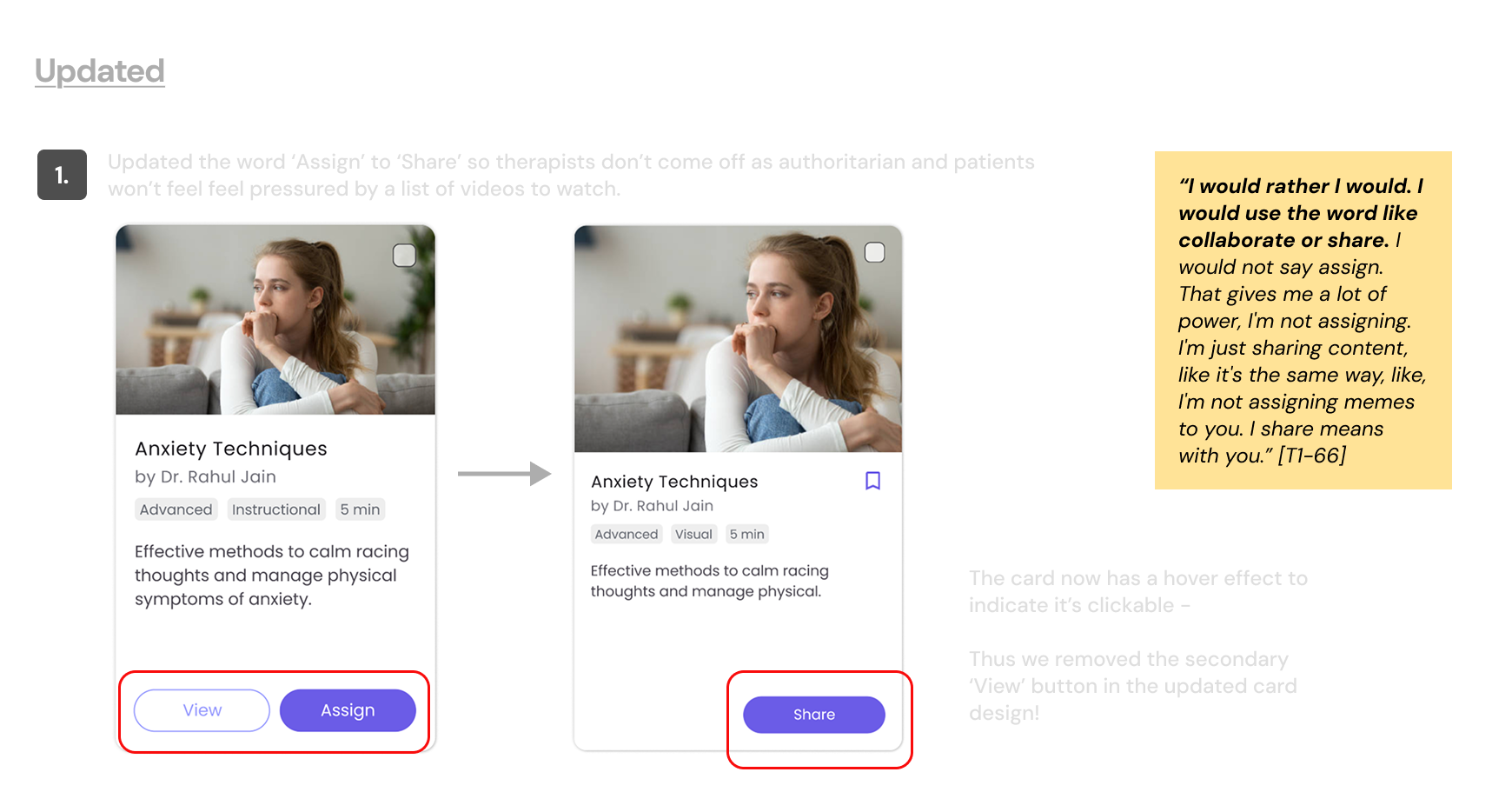
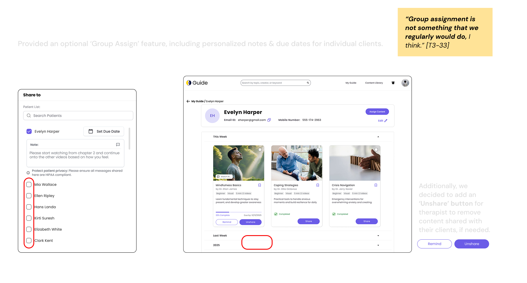
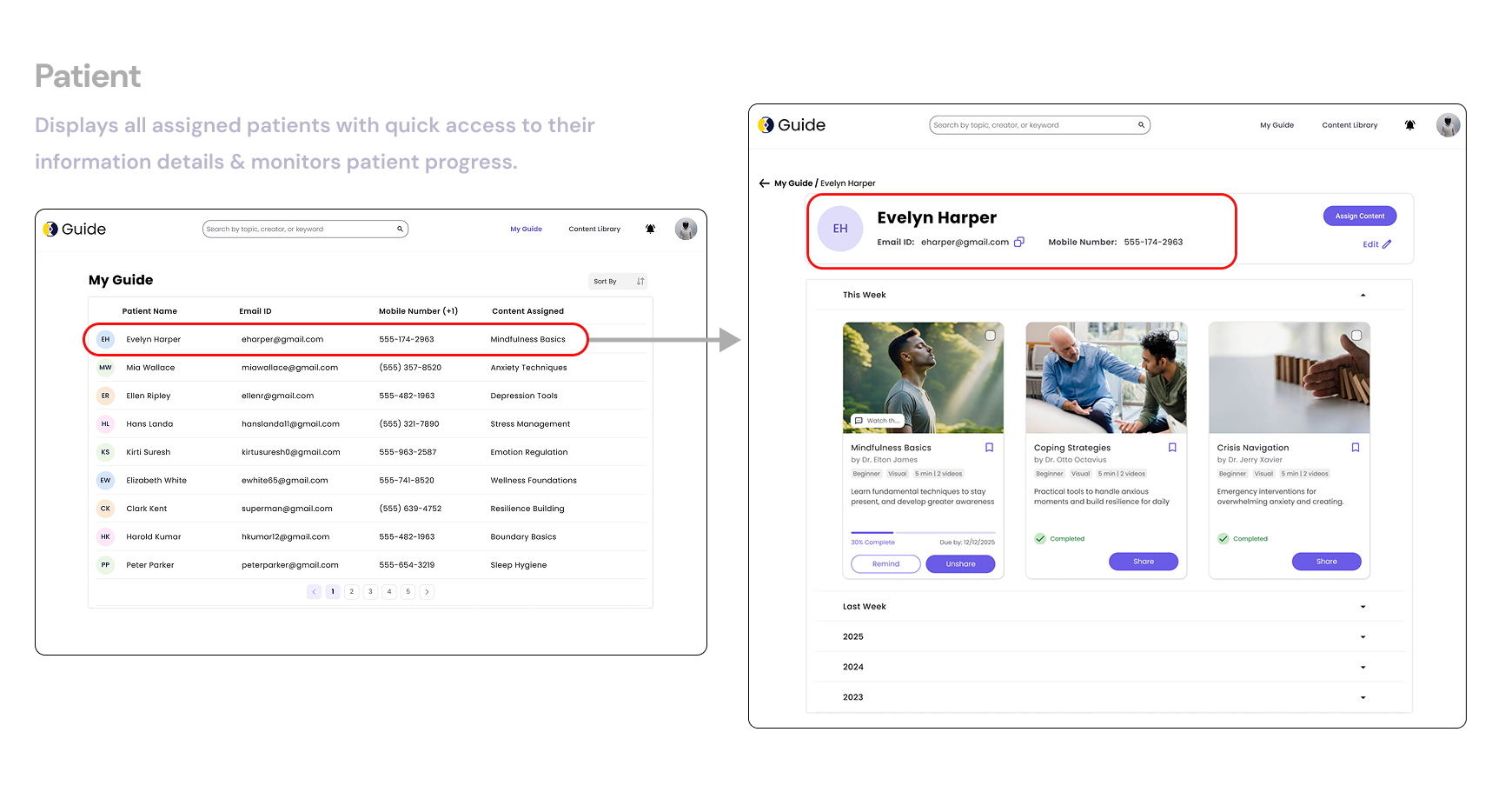
1. Assign Content
2. Track engagement
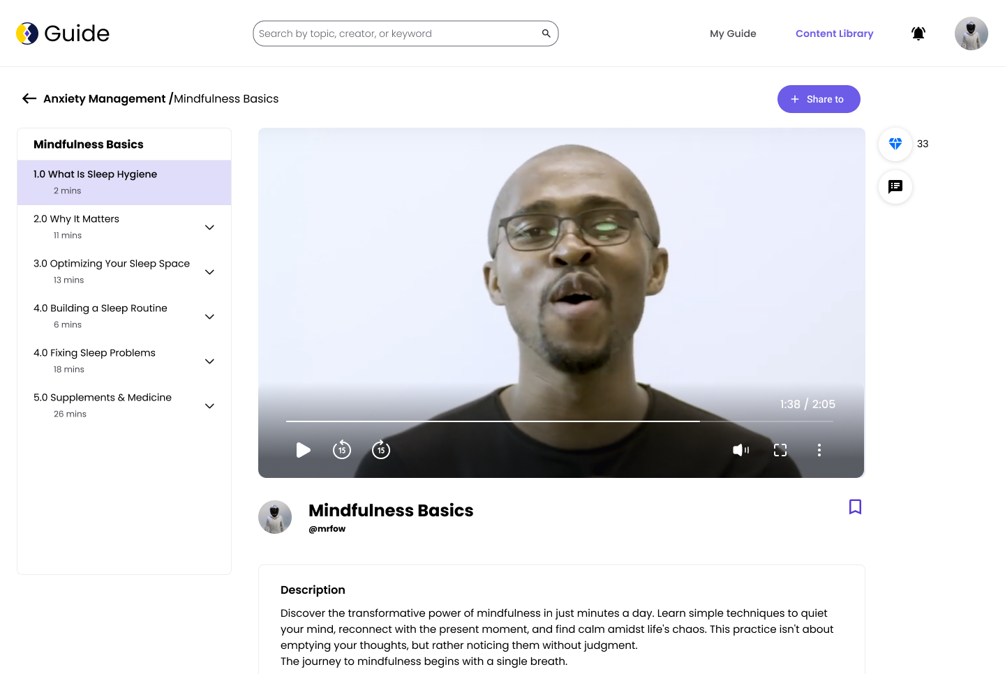
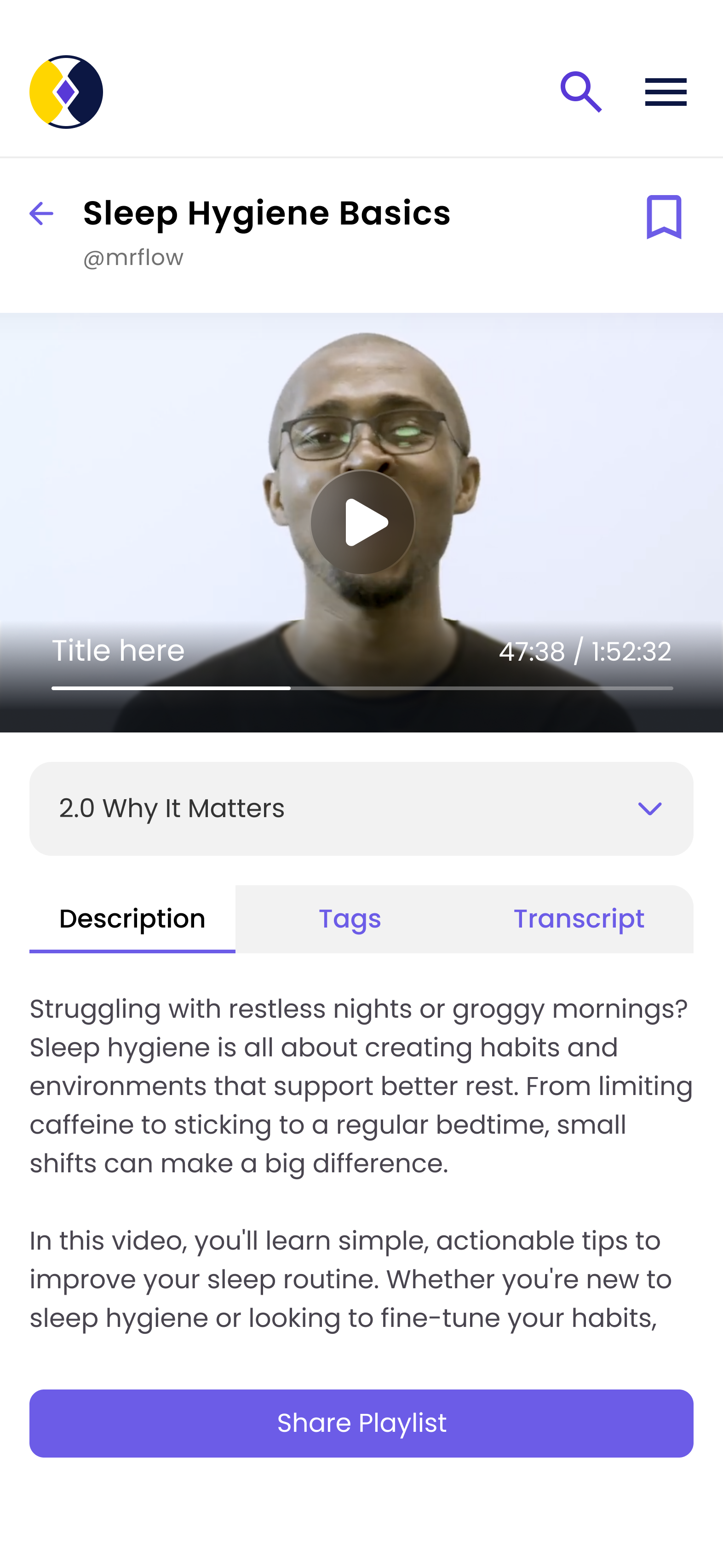
1. View and Save Content
2. Track completion
1. user flows
2. information architecture
3. collaborative voting sessions
We moved from abstract ideas to tangible next steps—defining clear actions to guide our design process and collaboration.
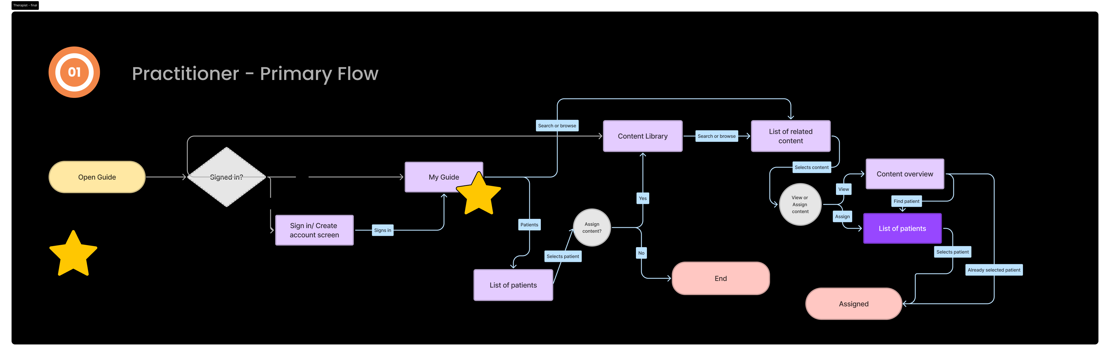
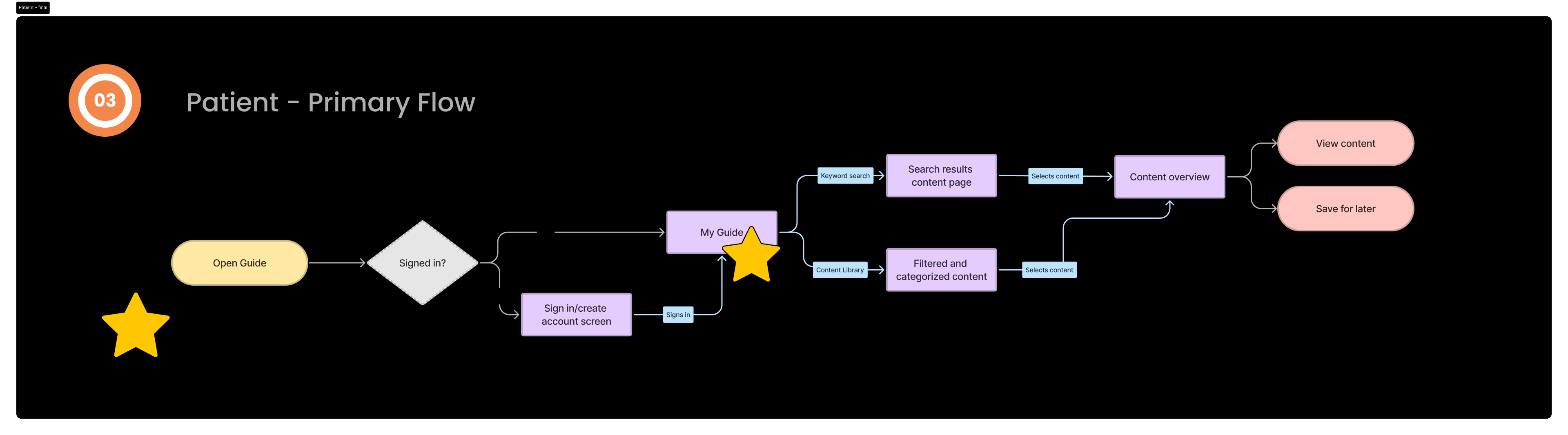
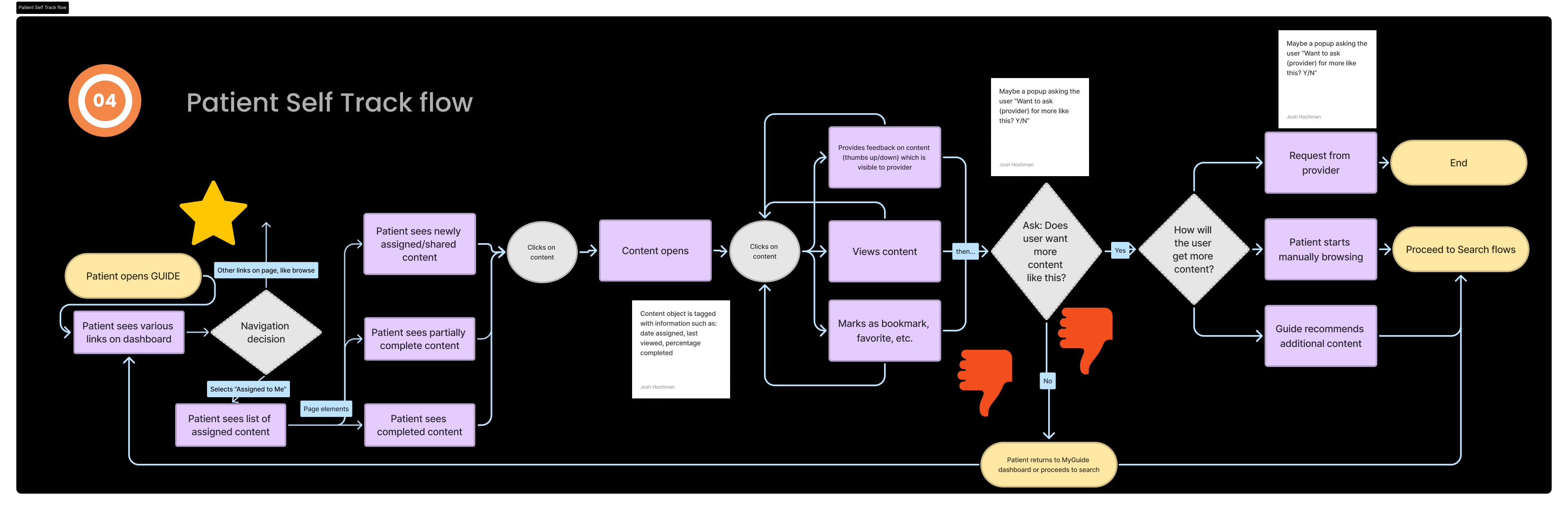
We mapped user flows to visualize how therapists and patients interact with key features—clarifying paths, pain points, and opportunities. These flows laid the foundation for our design decisions.
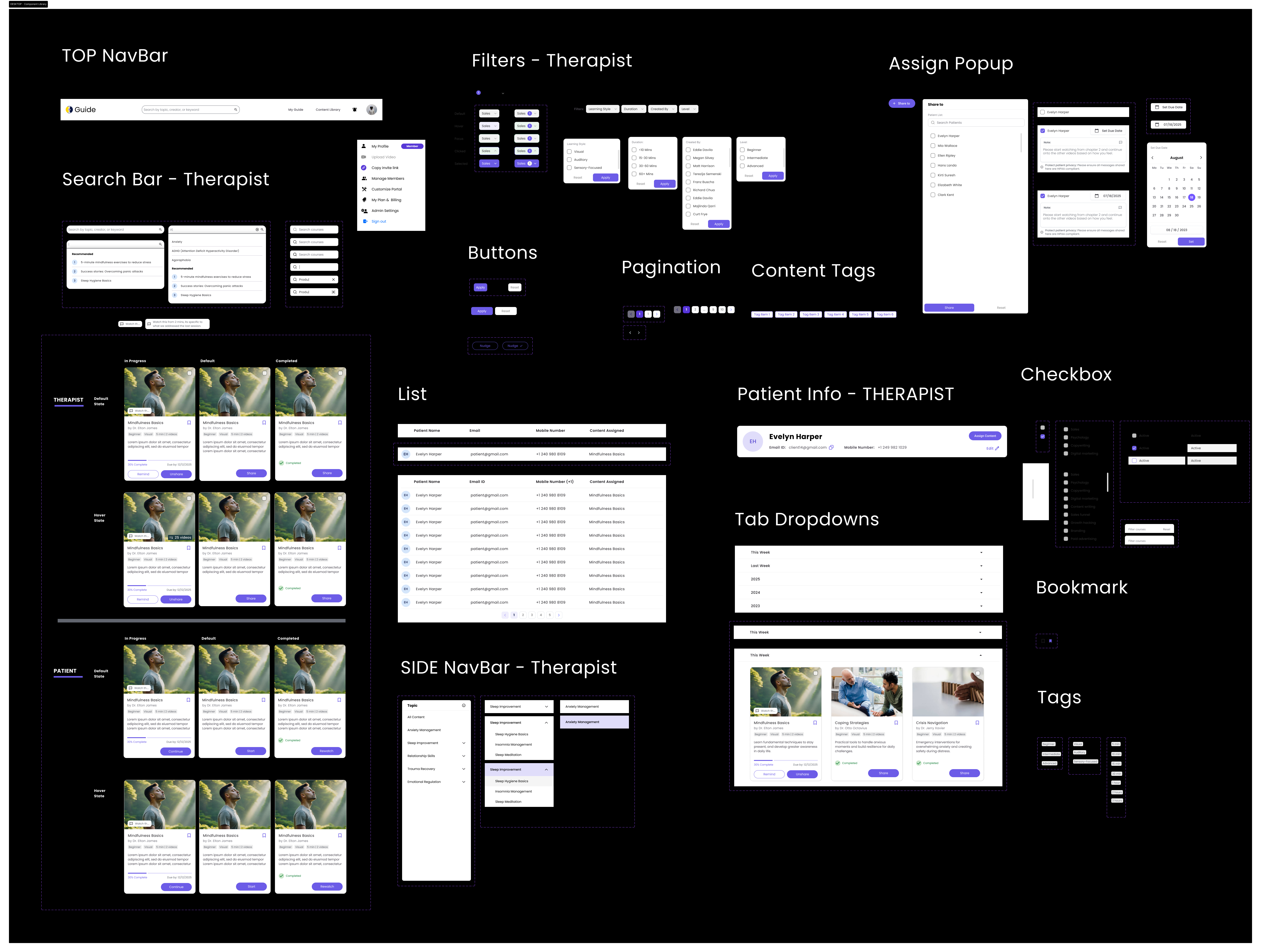
We iterated on component design by refining how each element relates to others—aligning with existing design guidelines and ensuring accessibility throughout.
5 Healthcare Proffesionals
4 Patients
1. To capture authentic, nuanced user perspectives
2. To build empathy and human connection with our actual users
Useberry
Final designs completed with all requested changes applied and aligned with team feedback.
Final designs are now adapted for mobile. I made layout and interaction changes to ensure the experience is optimized for smaller screens—improving readability, spacing, and touch accessibility while staying consistent with the desktop design.